

![]() The new Flexbox Inspector, created by Firefox DevTools, helps developers understand the sizing, positioning, and nesting of Flexbox elements. You can try it out now in Firefox DevEdition or join us for its official launch in Firefox 65 on January 29th.
The new Flexbox Inspector, created by Firefox DevTools, helps developers understand the sizing, positioning, and nesting of Flexbox elements. You can try it out now in Firefox DevEdition or join us for its official launch in Firefox 65 on January 29th.
The UX challenges of this tool have been both frustrating and a lot of fun for our team. Built on the basic concepts of the CSS Grid Inspector, we sought to expand on the possibilities of what a design tool could be. I’m excited to share a behind-the-scenes look at the UX patterns and processes that drove our design forward.
Research and ideation
CSS Flexbox is an increasingly popular layout model that helps in building robust dynamic page layouts. However, it has a big learning curve—at the beginning of this project, our team wasn’t sure if we understood Flexbox ourselves, and we didn’t know what the main challenges were. So, we gathered data to help us design the basic feature set.
Our earliest research on design-focused tools included interviews with developer/designer friends and community members who told us they wanted to understand Flexbox better.
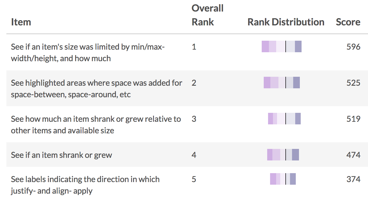
We also ran a survey to rank the Flexbox features folks most wanted to see. Min/max width and height constraints received the highest score. The ranking of shrink/grow features was also higher than we expected. This greatly influenced our plans, as we had originally assumed these more complicated features could wait for a version 2.0. It was clear however that these were the details developers needed most.
Most of the early design work took the form of spirited brainstorming sessions in video chat, text chat, and email. We also consulted the experts: Daniel Holbert, our Gecko engine developer who implemented the Flexbox spec for Firefox; Dave Geddes, CSS educator and creator of the Flexbox Zombies course; and Jen Simmons, web standards champion and designer of the Grid Inspector.
The discussions with friendly and passionate colleagues were among the best parts of working on this project. We were able to deep-dive into the meaty questions, the nitty-gritty details, and the far-flung ideas about what could be possible. As a designer, it is amazing to work with developers and product managers who care so much about the design process and have so many great UX ideas.
Visualizing a new layout model
After our info-gathering, we worked to build our own mental models of Flexbox.
While trying to learn Flexbox myself, I drew diagrams that show its different features.

My colleague Gabriel created a working prototype of a Flexbox highlighter that greatly influenced our first launch version of the overlay. It’s a monochrome design similar to our Grid Inspector overlay, with a customizable highlight color to make it clearly visible on any website.
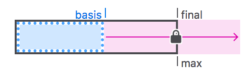
We use a dotted outline for the container, solid outlines for items, and diagonal shading between the items to represent the free space created by justify-content and margins.


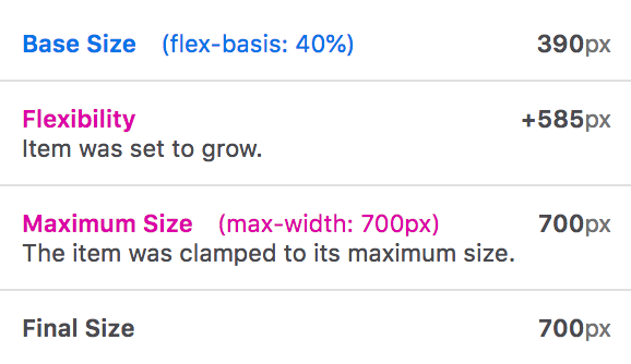
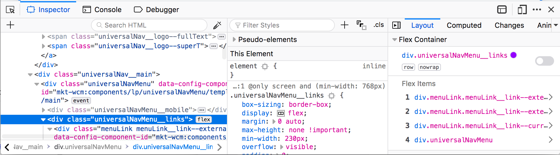
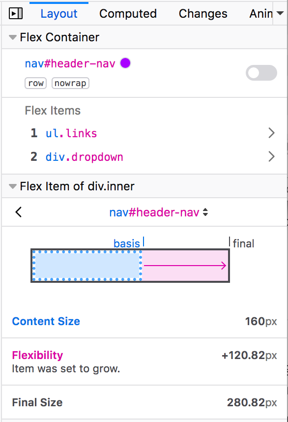
We got more adventurous with the Flexbox pane inside DevTools. The flex item diagram (or “minimap” as we love to call it) shows a visualization of basis, shrink/grow, min/max clamping, and the final size—each attribute appearing only if it’s relevant to the layout engine’s sizing decisions.
Many other design ideas, such as these flex container diagrams, didn’t make it into the final MVP, but they helped us think through the options and may get incorporated later.
Color-coded secrets of the rendering engine
With help from our Gecko engineers, we were able to display a chart with step-by-step descriptions of how a flex item’s size is determined. Basic color-coding between the diagram and chart helps to connect the two UIs.
Markup badges and other entry points
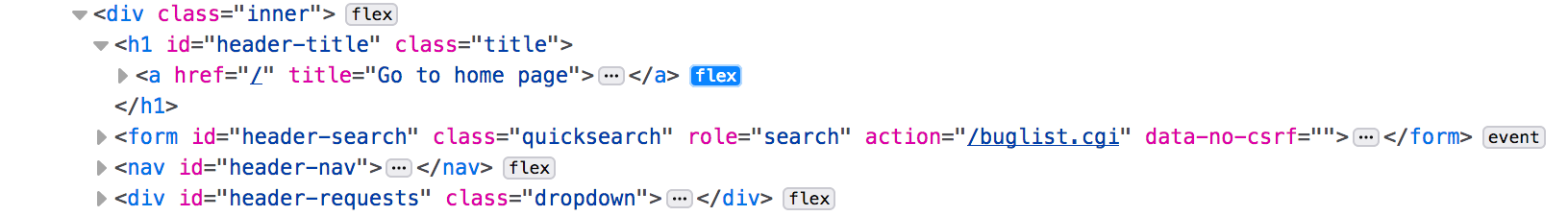
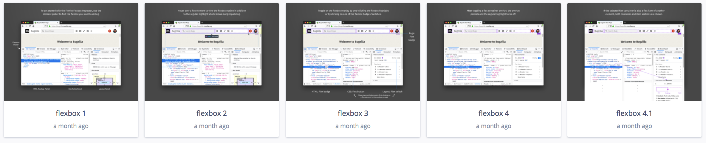
Flex badges in the markup view serve as indicators of flex containers as well as shortcuts for turning on the in-page overlay. Early data shows that this is the most common way to turn on the overlay; the toggle switch in the Layout panel and the button next to the display:flex declaration in Rules are two other commonly used methods. Having multiple entry points accommodates different workflows, which may focus on any one of the three Inspector panels.
Surfacing a brand new tool
Building new tools can be risky due to the presumption of modifying developers’ everyday workflows. One of my big fears was that we’d spend countless hours on a new feature only to hide it away somewhere inside the complicated megaplex that is Firefox Developer Tools. This could result in people never finding it or not bothering to navigate to it.
To invite usage, we automatically show Flexbox info in the Layout panel whenever a developer selects a flex container or item inside the markup view. The Layout panel will usually be visible by default in the third Inspector column which we added in Firefox 62. From there, the developer can choose to dig deeper into flex visualizations and relationships.
Mobile-inspired navigation & structure
One new thing we’re trying is a page-style navigation in which the developer goes “forward a page” to traverse down the tree (to child elements), or “back a page” to go up the tree (to parent elements). We’re also making use of a select menu for jumping between sibling flex items. Inspired by mobile interfaces, the Firefox hamburger menu, and other page-style UIs, it’s a big experimental departure from the simpler navigation normally used in DevTools.
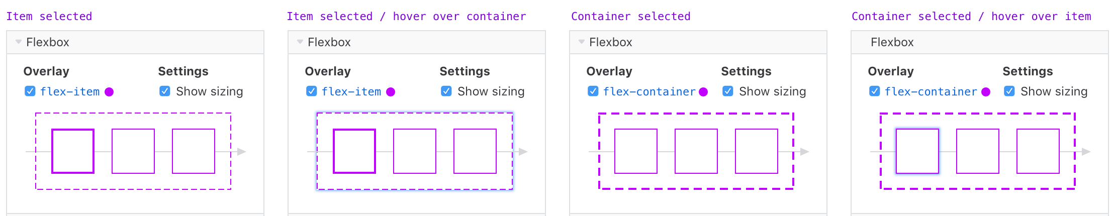
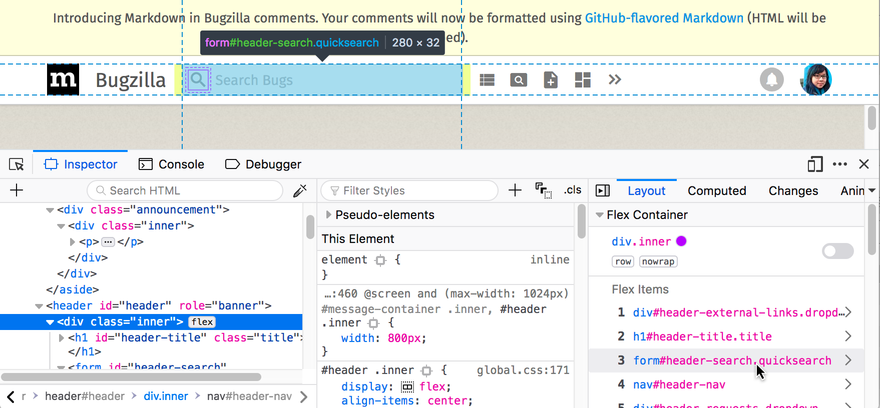
One of the trickier parts of the structure was coming up with a cohesive design for flex containers, items, and nested container-items. My colleague Patrick figured out that we should have two types of flex panes inside the Layout panel, showing whichever is relevant: an Item pane or a Container pane. Both panes show up when the element is both a container and an item.
Tighter connection with in-page context
When hovering over element names inside the Flexbox panes, we highlight the element in the page, strengthening the connection between the code and the output without including extra ‘inspect’ icons or other steps. I plan to introduce more of this type of intuitive hover behavior into other parts of DevTools.
Testing and development
After lots of iteration, I created a high-fidelity prototype to share with our community channels. We received lots of helpful comments that fed back into the design.
We had our first foray into formal user testing, which was helpful in revealing the confusing parts of our tool. We plan to continue improving our user research process for all new projects.
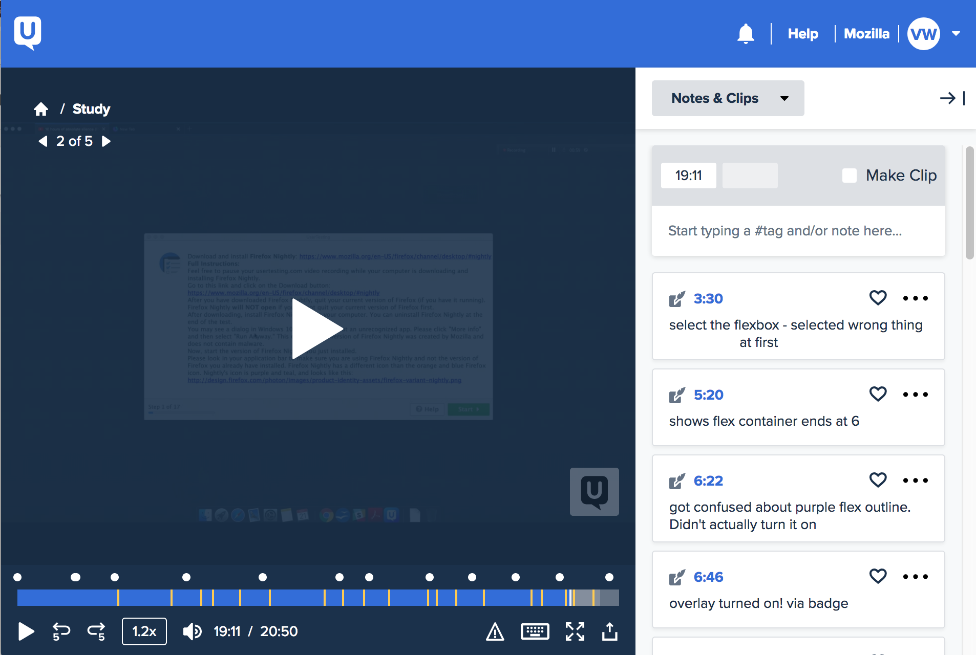
UserTesting asks participants to record their screens and think aloud as they try out software.
Later this month, developers from our team will be writing a more technical deep-dive about the Flexbox Inspector. Meanwhile, here are some fun tidbits from the dev process: Lots and lots of issues were created in Bugzilla to organize every implementation task of the project. Silly test pages, like this one, created by my colleague Mike, were made to test out every Flexbox situation. Our team regularly used the tool in Firefox Nightly with various sites to dog-food the tool and find bugs.
What’s next
2018 was a big year for Firefox DevTools and the new Design Tools initiative. There were hard-earned lessons and times of doubt, but in the end, we came together as a team and we shipped!
We have more work to do in improving our UX processes, stepping up our research capabilities, and understanding the results of our decisions. We have more tools to build—better debugging tools for all types of CSS layouts and smoother workflows for CSS development. There’s a lot more we can do to improve the Flexbox Inspector, but it’s time for us to put it out into the world and see if we can validate what we’ve already built.
Now we need your help. It’s critical that the Flexbox Inspector gets feedback from real-world usage. Give it a spin in DevEdition, and let us know via Twitter or Discourse if you run into any bugs, ideas, or big wins.
Thanks to Martin Balfanz, Daniel Holbert, Patrick Brosset, and Jordan Witte for reviewing drafts of this article.
About Victoria Wang
Victoria is a Portland-based UX designer at Mozilla who works on Firefox DevTools.
One comment