Introduction
The approach to designing Firefox OS for Television is fundamentally different from phones or tablets. It requires rethinking of how experiences are structured and how to fulfill the needs of a wide range of uses. Firefox OS for Television was designed not only to simplify the UI, but also to optimize interaction, and to help users get the content they want immediately. Below is the detailed information about the concept of our visual and motion designs.
User Interface Design
Responsive
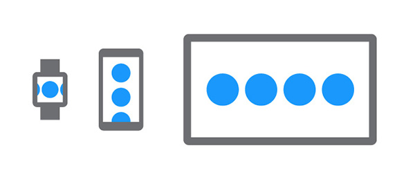
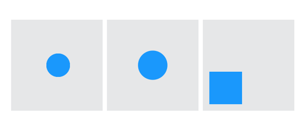
The controls are designed in code (SVG) and will scale to any screen size without the need for new bitmap graphics. The UI is responsive, it works across devices of all shapes and sizes, from small screen watches to giant screen TVs. The UI components are created in SVG by using simple flat circles. We minimized the use of gradients and reduced shadows as much as possible, but made sure that the controls can be identified distinctly.
Style
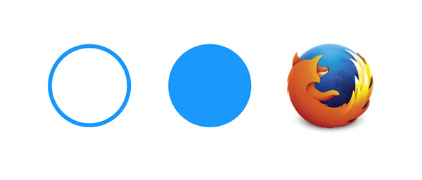
Why a circle? We chose to use the circular shape of our Firefox logo as a source of inspiration. Circles have free movement (they naturally roll), shading and lines can enhance this sense of movement within the circle. Circles are warm, humane, comforting and natural. Their movement suggest energy and power. Their completeness suggests infinity, unity, and harmony. You’ll see the circle used throughout the designs of the components, especially in the animations.
Customizable
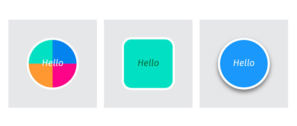
By changing a color, shape or style of an animation, the controls can be customized to suit any brand need. All controls are all well designed and created as CSS components allowing for effortless customization.
Design in Animations
Groundwork
A great way to make your animations move in a more lifelike manner is to vary the rate at which the object moves. Animation should imitate the world that we live in. So, it’s important to ensure that the pace of movements within your animations, making sure they reflect the real world.
Positioning / Scaling / Rotating
Motion easing will create a more natural look when applied to positions, rotations, deformations, or scale. This will add acceleration and deceleration to the motion, and can make the experience much more playful and delightful.
Responsive
Motion should be responsive and intuitive. It should react in a way that reassures the user, rather than surprises or confuses them. The reaction of the UI, to a users actions, should be corresponding and comprehensible.
Personality
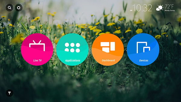
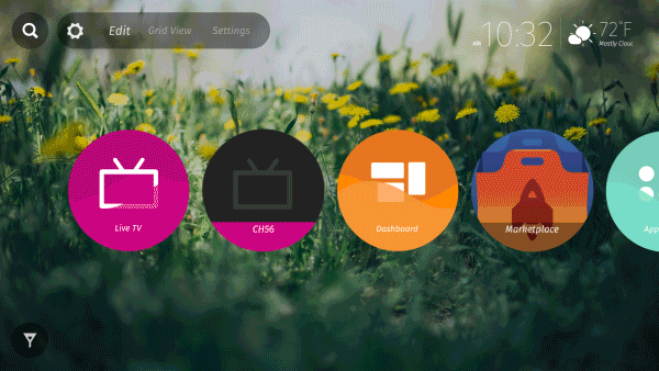
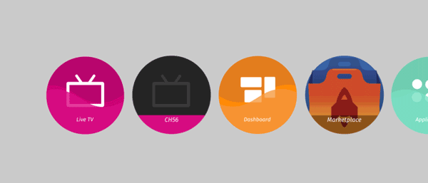
The most obvious principle is that any motion or animation should be of the highest standard possible. We animated and applied liquid motion to the main launchers (TV, Apps, Devices, and Dashboard) resulting in motion as the user selects each one of them. To users, this bespoke motion is truly delightful allowing for further engagement.

Orientation
Motion should help ease the user through the experience. It should establish the “physical space” of the UI by the way objects appear on and off the screen, or establish the user’s focus. It should aid the flow of actions, giving clear guidance through the navigation model. Here in our TV home design, we used scaled motion to guide the users through which objects are selected, and keep the user orientated within the interaction path.
Less is more
Subtlety is key when designing the motion to UI. Motion should be used to help the user stay focused, therefore restraint is needed as the design is used as an accent to the interaction design and should not dominate the experience.
For more information and guides about Firefox OS TV, please refer to the session TVs and connected devices and find other links for relevant articles below.
I hope you enjoyed this post about how we designed Firefox OS TV. If you have any feedback or ideas to help Firefox OS Design Team improve ourselves, please leave a comment.
─ By Scott Wu, Firefox OS UX designer